


In my last post, I wrote about one foundational decision I made in regards to the book's structure. That decision I owed to another writer's novel. But a different aesthetic decision I can trace back to Van Gogh's paintings themselves. This feature of my book came to mind almost immediately after I conceived of writing it at all: To distinguish each of the separate "eras" in Van Gogh's life with a signature color. After all, his metamorphosis as a colorist is one of the most significant--perhaps the most significant--aspects of his development as an artist. (Not to sound too banal, but what blew me away in my visit to the Van Gogh museum was the intense, literally glowing, brightness of the pictures.) At different times during his career, different colors dominated. And it occurred to me that you could even characterize the years before he became a painter with signature colors; not colors that are found in paintings (because he was composing none) but colors which capture the "shade" of his life and ambitions. I would emphasize these shades by using the respective color words, or synonyms, frequently in the respective chapters. I didn't want this to be over the top, too heavy, too obvious, or too distracting, and so far I think I've succeeded. If anything, as I've revised I've cut back actually on these color words. But the scheme should still apparent to anyone reading carefully. Or even anyone reading loosely, since each chapter carries a color word as its title. In fact, the title of the whole book (have I mentioned it yet on this blog?) is one big fat color word of its own: Yellow.
Choosing the signature colors wasn't very hard. Some are obvious. Yellow, for instance, for Arles, where he famously and deliberately strove for the "high yellow note" that so dominated his paintings from that time. For his time in the hospital at Saint-Rémy I chose aquagreen: a decidedly cooler color than yellow and one, in fact, that does appear in the Saint-Rémy paintings. But his actual use of the color is less important that what the choice indicates: a deliberate effort to scale back from extremes, an overt desire to calm down both his pictures and his life. Nuenen became brown because there is simply so much brown in those very earthy paintings; the Borinage became black because a.) What else can you choose to describe his time among coal miners, and b.) in the Borinage he suffered through the worst depression of his life. His years trying to learn how to become a missionary and lay preacher? White, of course, because it suggests both purity and a white-hot fanaticism. His childhood in rural Brabant? Green. Paris? My first inclination was red. I thought it captured the dynamism of the city and suggested too his foray into intenser colors. But finally I went with orange. Because I see more orange than red in the Paris paintings and because there's something more off-center and sickly about the former color. (Van Gogh always recognized that he learned a great deal in Paris, but he also thought the city almost ruined his health.) There are some other periods and other colors, but you get the idea. Color isn't merely what Van Gogh's paintings were made from, it's embedded in the structure of my text.
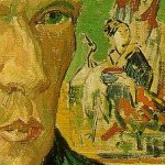
[Above on the right is the very brown "Cottage with Peasant Woman Digging" (1885), painted in Nuenen, and, on the left, "Arles: View from the Wheat Fields" (1888).]


0 comments:
Post a Comment